Brylcreem.
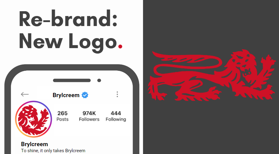
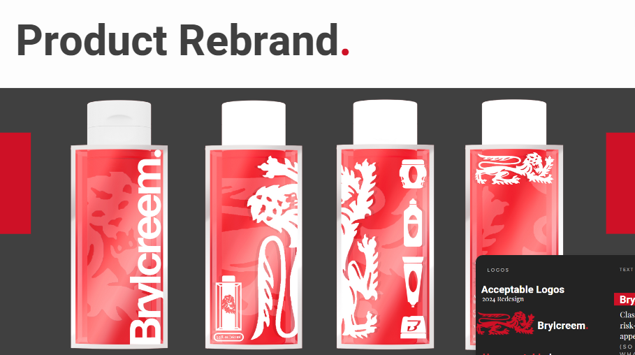
Brylcreem once stuck in the past (like.. pre-World War 2 past), found itself in need of a makeover. Traditionally associated with older men, our project saw an opportunity for Brylcreem to break free from its shiny confines and resonate with a younger, more diverse audience. Recognizing its potential to be androgynous and shine in a new light, we embarked on a journey to refresh its image. Turning Brylcreem into not a product that was cool, but a product that makes you cool. Guided by the insight that "Nobody likes a try hard," we created the idea that "To shine, it only takes Brylcreem." To do this, Brylcreem needed a more modern brand identity featuring updated packaging and a revamped logo that paid homage to its iconic roots. Leveraging unconventional advertising spaces like bathroom mirrors in bars and elevator ceilings, our goal was to inject a sense of excitement into everyday routines and spark curiosity in a brand once thought of as belonging to the past.
Group project with Lizzie Batten, Katie Hall, Ben Crispin, and Katie Jameson


